Dante
DANTE is a multifunctional financial service catering to countries in Central Asia, the Arab region, Russia, and former CIS countries. It enables users to execute both banking transfers and cryptocurrency transactions within a single application. Moreover, the service offers the issuance of international plastic bank cards.

DANTE’s standout feature is its game-changing nature. The service's feature set is unique, so its identity must differ significantly from the styles of other financial services and transcend the aesthetic norms of this category.
The service is launching simultaneously in countries with diverse cultural characteristics, which was a determining factor in choosing a symbol that holds positive connotations across all cultures.




Challenge
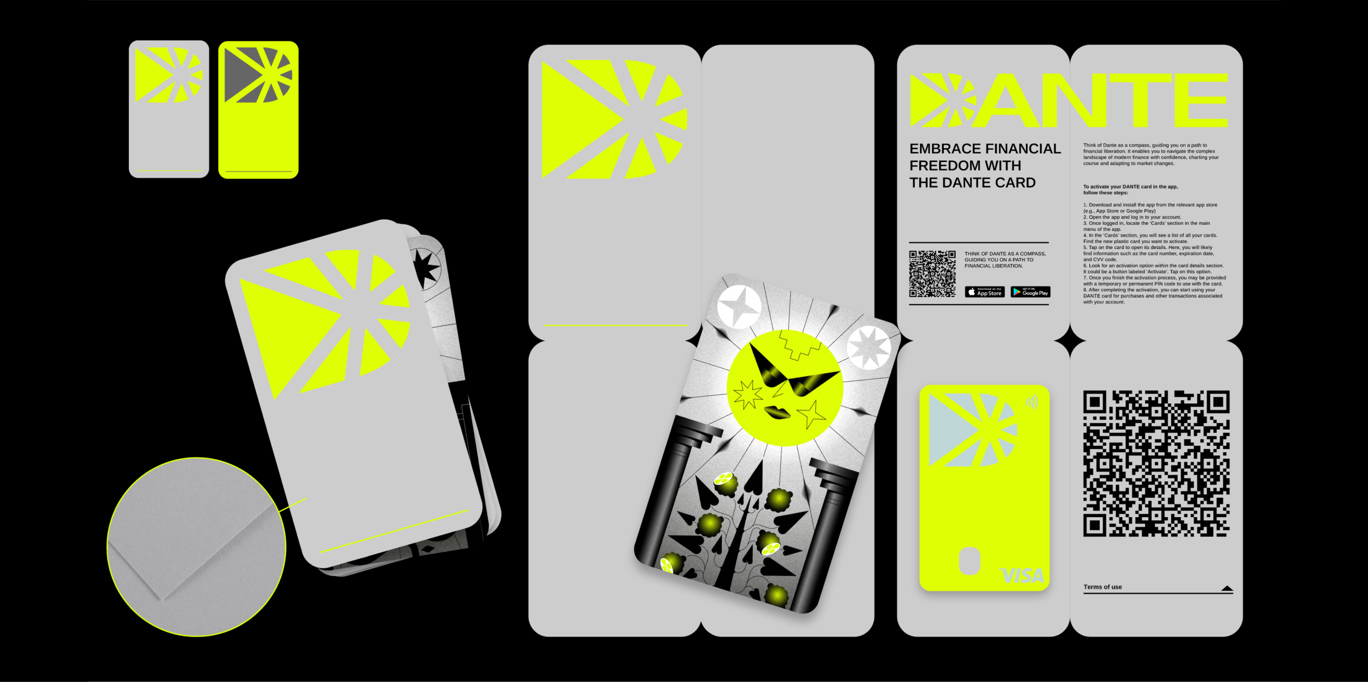
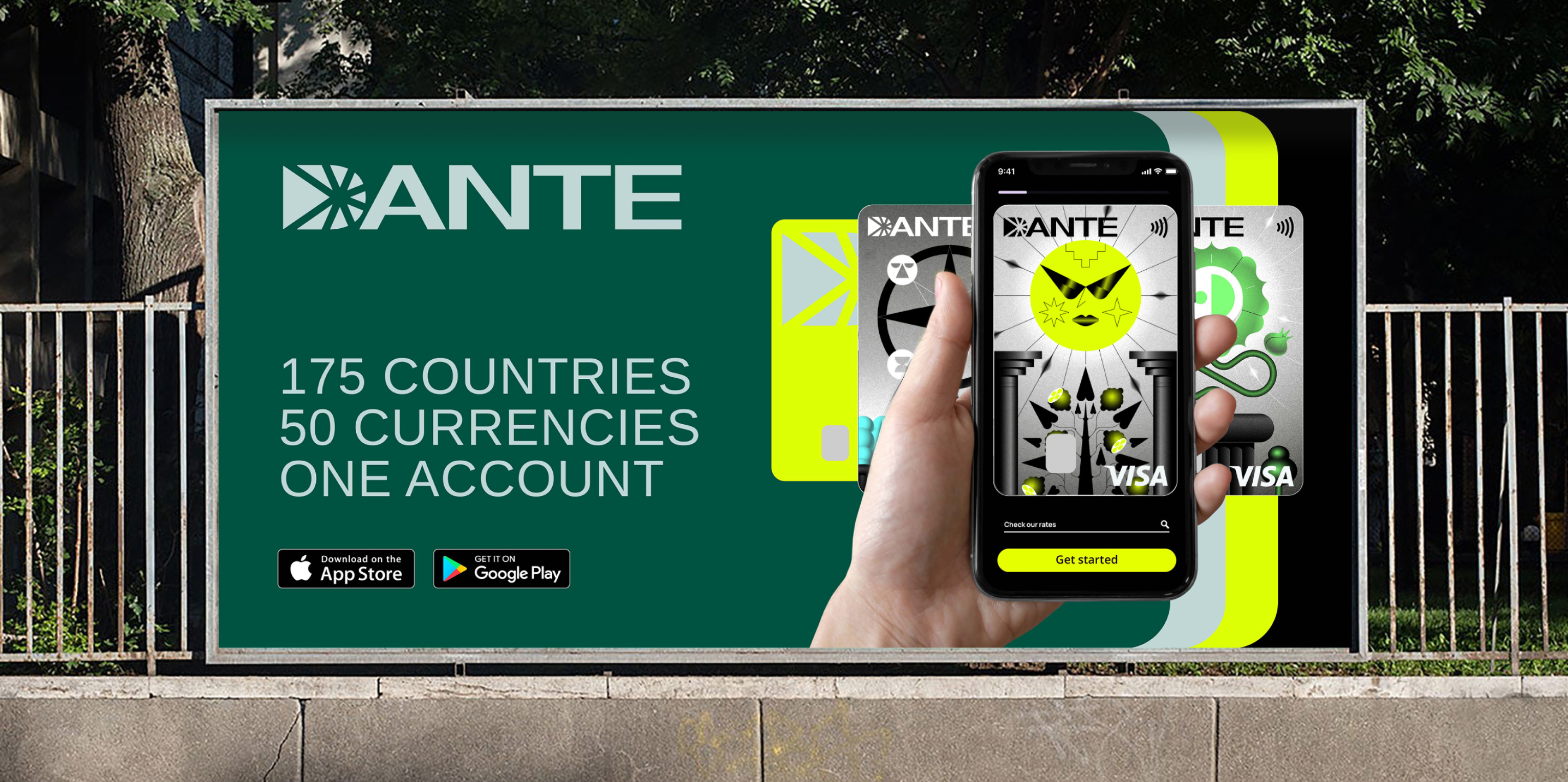
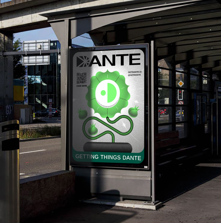
The key touchpoints of the service with the audience are the app and the plastic bank card. Therefore, it was important to develop a symbol that would serve as a recognizable icon and simultaneously be the first letter of the brand’s name.
Additionally, the symbol needed to incorporate a solar motif, which was chosen by the project’s team. Furthermore, we were tasked with creating illustrations referencing the symbolism of tarot cards.



Solution
The identity of this vibrant project is infused with symbols from various fields. In the service's name, DANTE, there's a metaphor for overcoming the realms of international financial transactions, which can sometimes feel like the circles of hell. The sun or star in the symbol serves as a beacon, guiding users through banking bureaucracy.
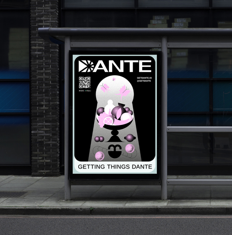
Comparing the bank card to a card of fate drawn from the tarot deck continues the narrative of choosing a path.
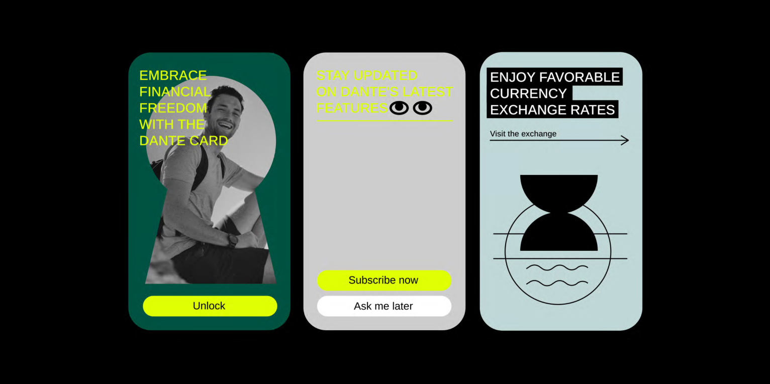
The color palette supports the chosen theme: Vibrant lemon yellow "illuminates" the way, complemented by subdued and tonally contrasting colors.
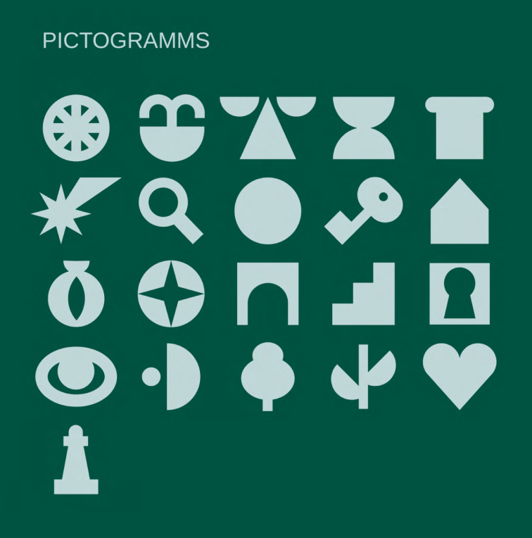
Seven illustrations based on tarot arcana foretell prosperity and positive outcomes, with each including three pictograms familiar to a wide audience.
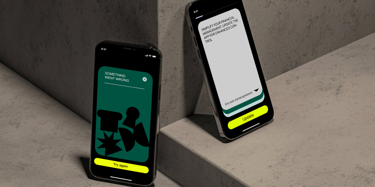
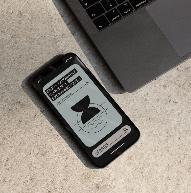
Users can choose between the illustrations for their plastic card. Individually, the pictograms are used to mark service directions in communications and as icons in the app.
