Vesnaskoro
VESNASKORO is a PR agency specializing in the cultural sphere. Among its projects are large-scale exhibitions, festivals, theatrical projects, and communications support for cultural institutions.
At the time of establishing the agency, the team already had a solid image and longstanding reputation among the media and professionals within the cultural sphere. The next step was to create a B2B brand in the delicate cultural domain.


Challenge
It was important for the agency to reflect its connection with cultural projects in its new style while preserving the individuality of the team's established image.
The goal was to create an elegant corporate identity that would help represent various cultural projects with their own style and tone.
Solution
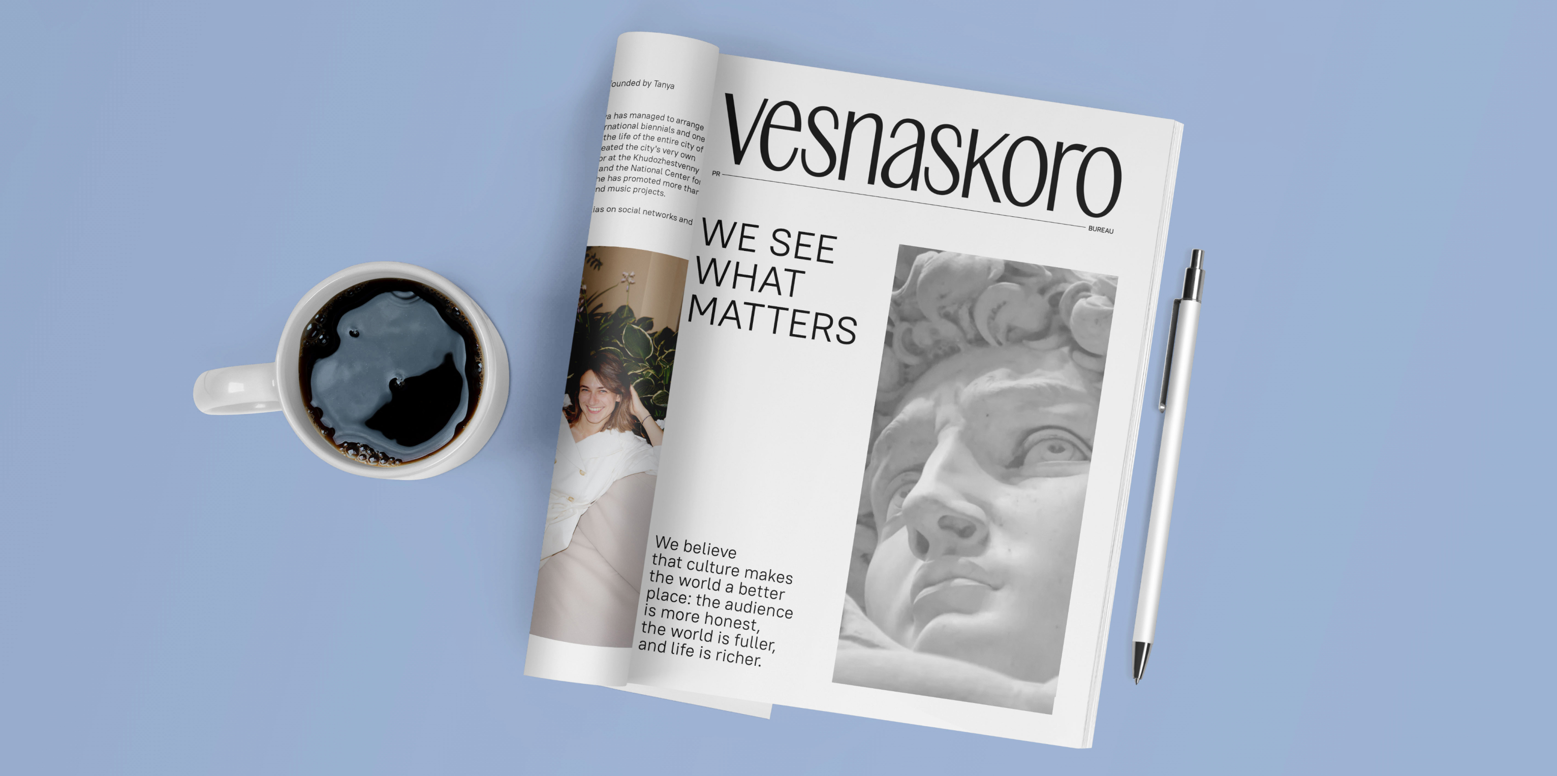
The agency inherited the name Vesnaskoro, the former alias of the brand's founder. It signifies the ability to look beyond the horizon, see the essence in everything, and turn it into strength.
It also represents openness, warmth, and a personal approach in everything, from the first contact to the successful implementation of each project or service.
The brand's ideology is based on the principles of recognizing the unique qualities of each project and being able to convey them to an audience. Among the brand's core values, we emphasized the ability to skillfully connect — people and ideas, themes and brands, events and circumstances.
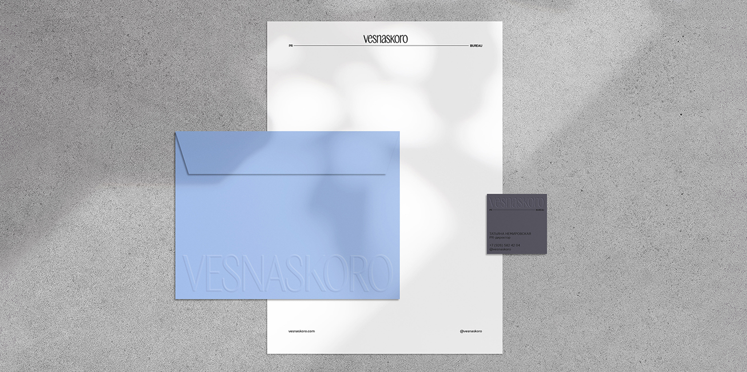
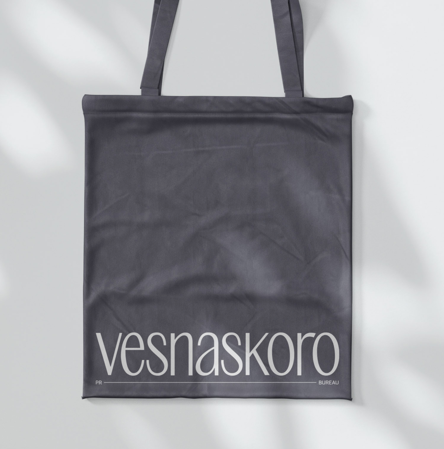
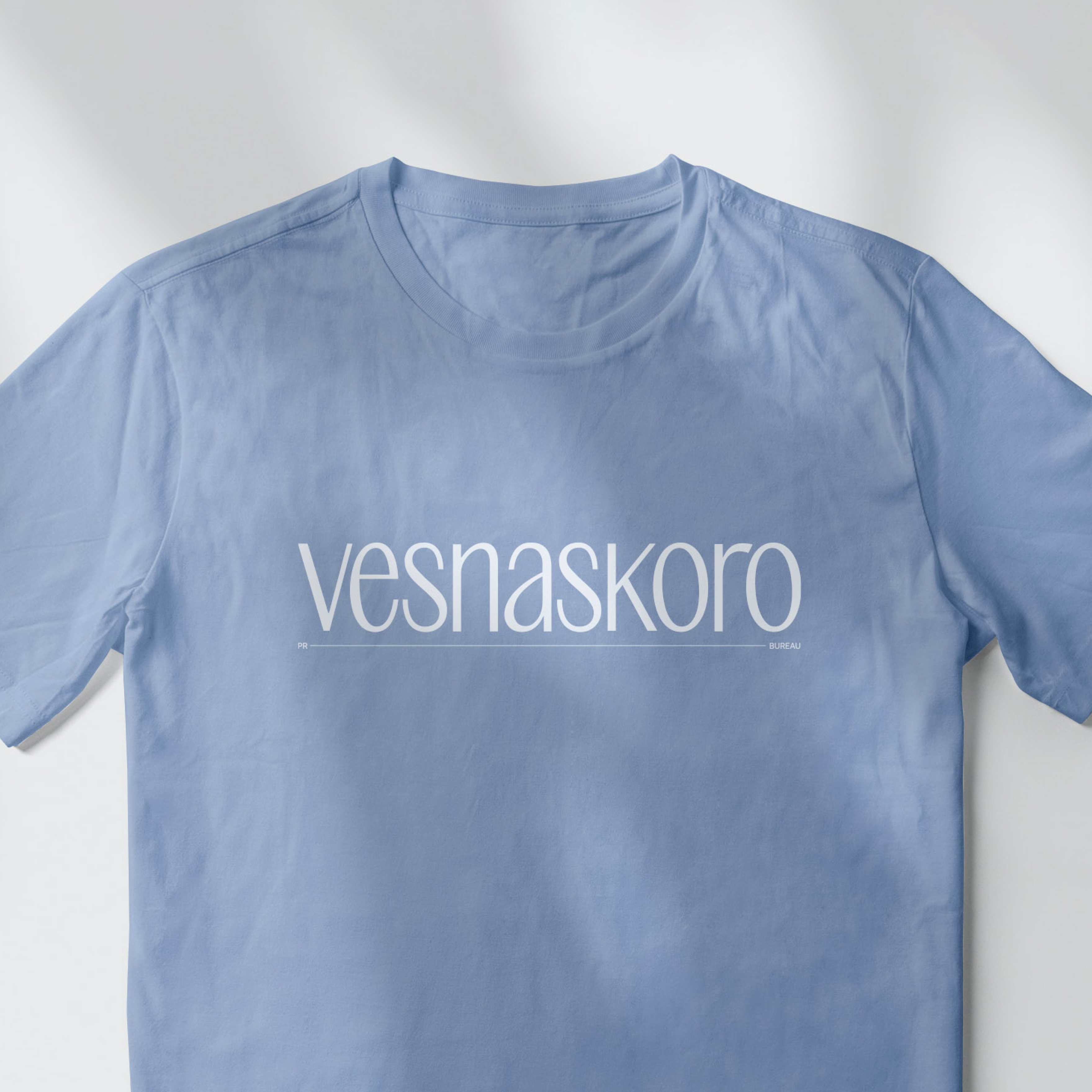
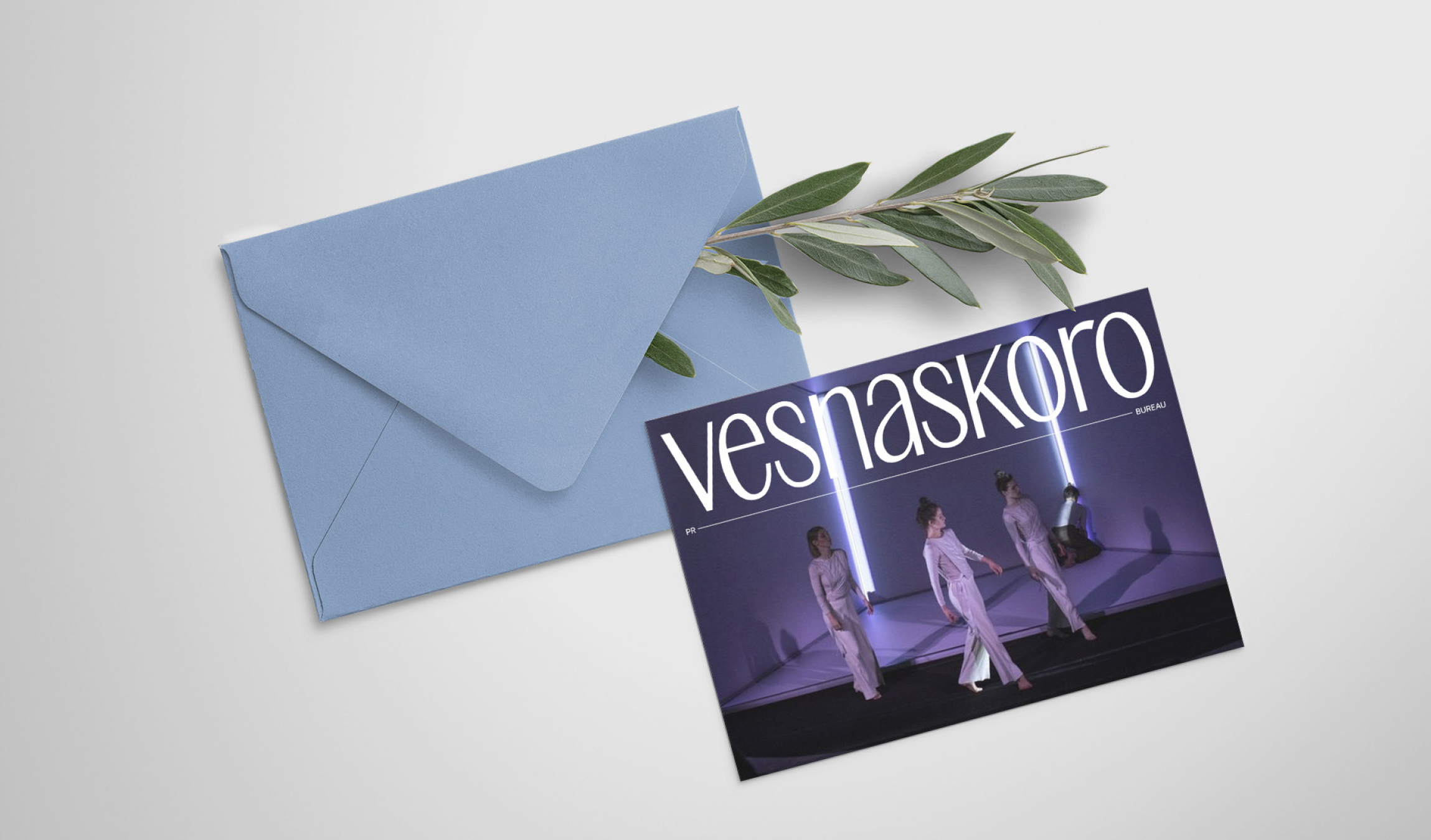
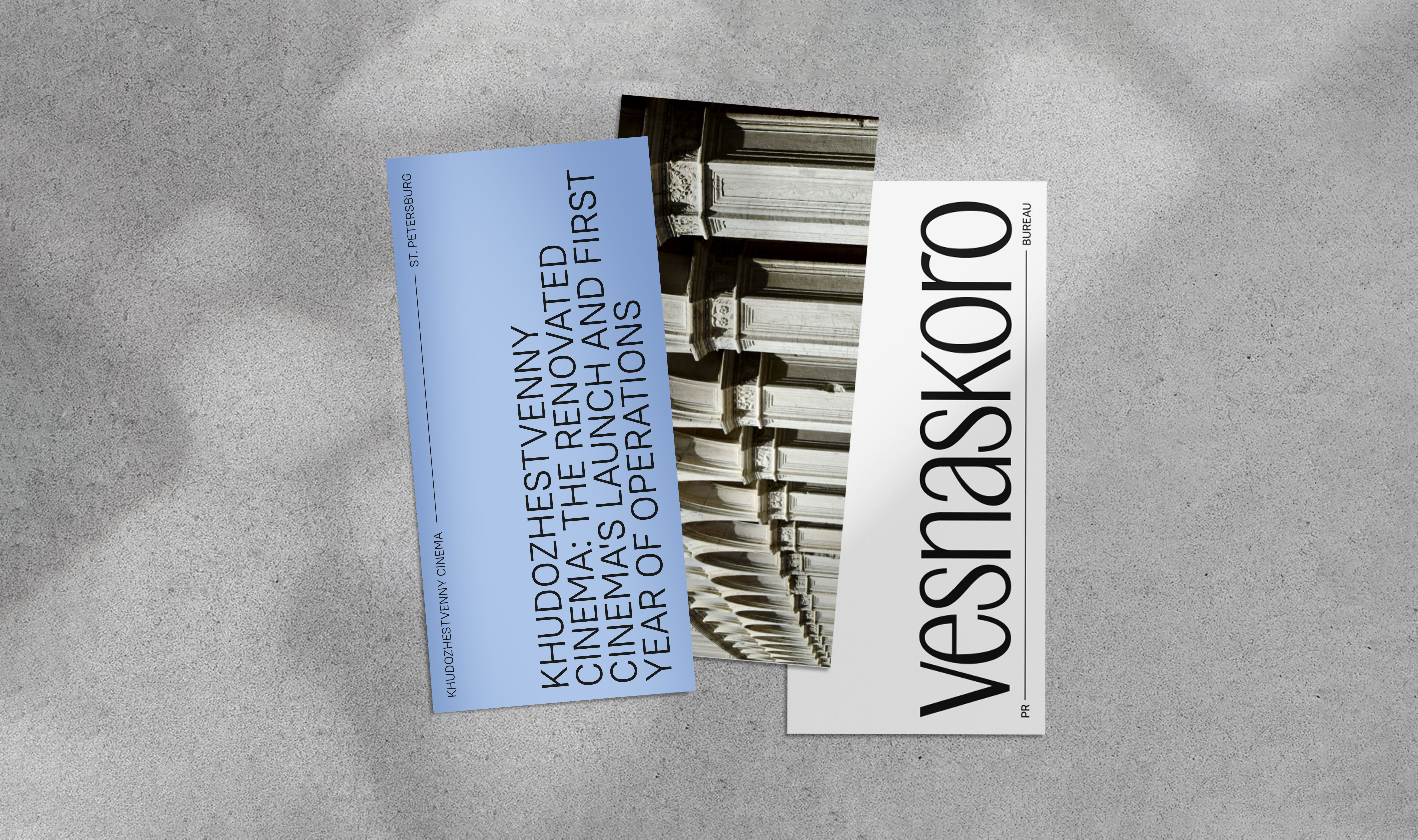
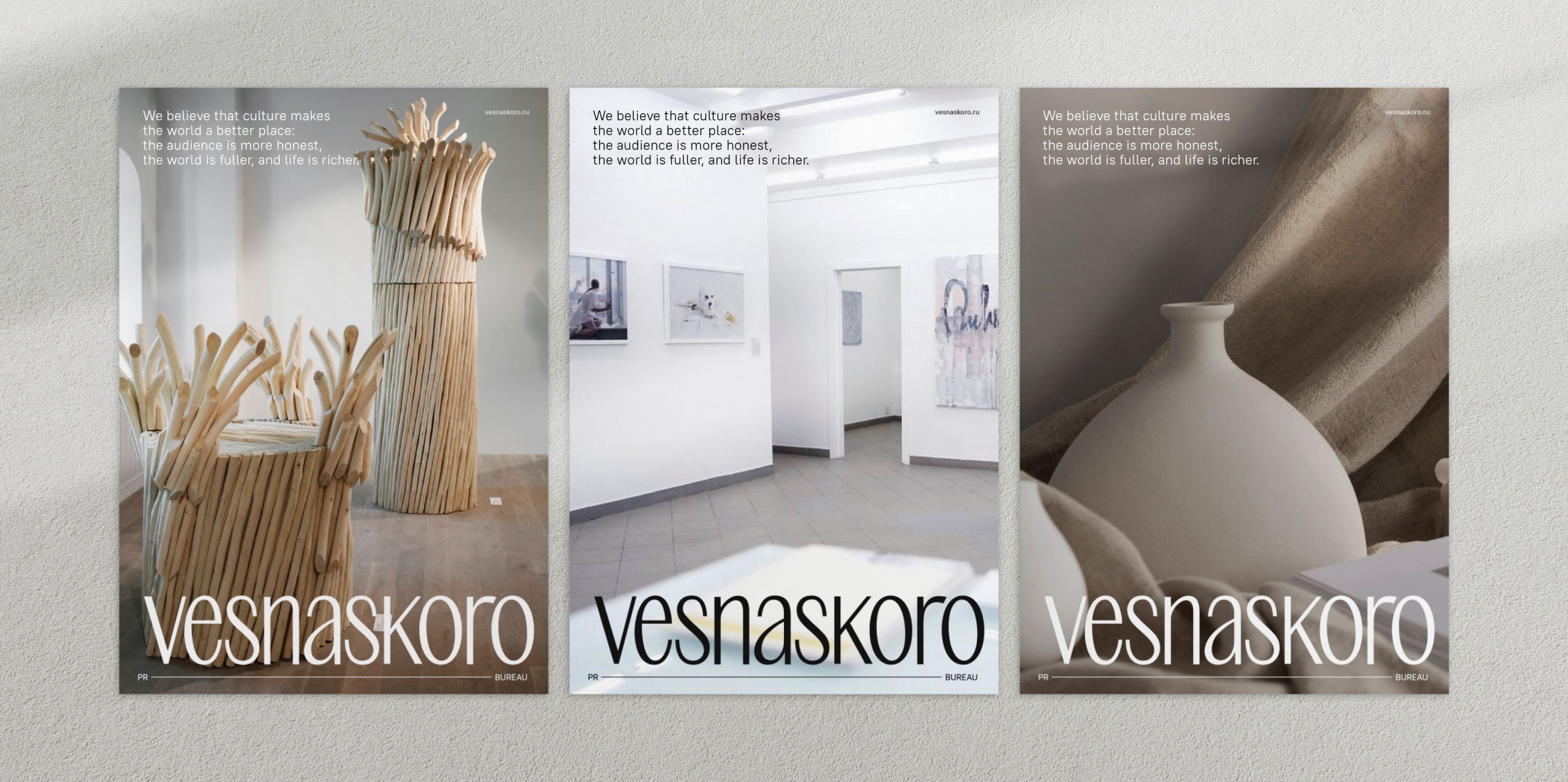
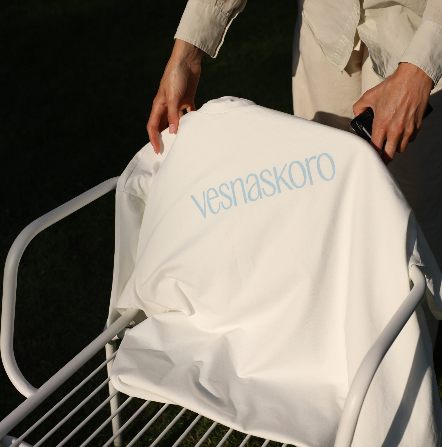
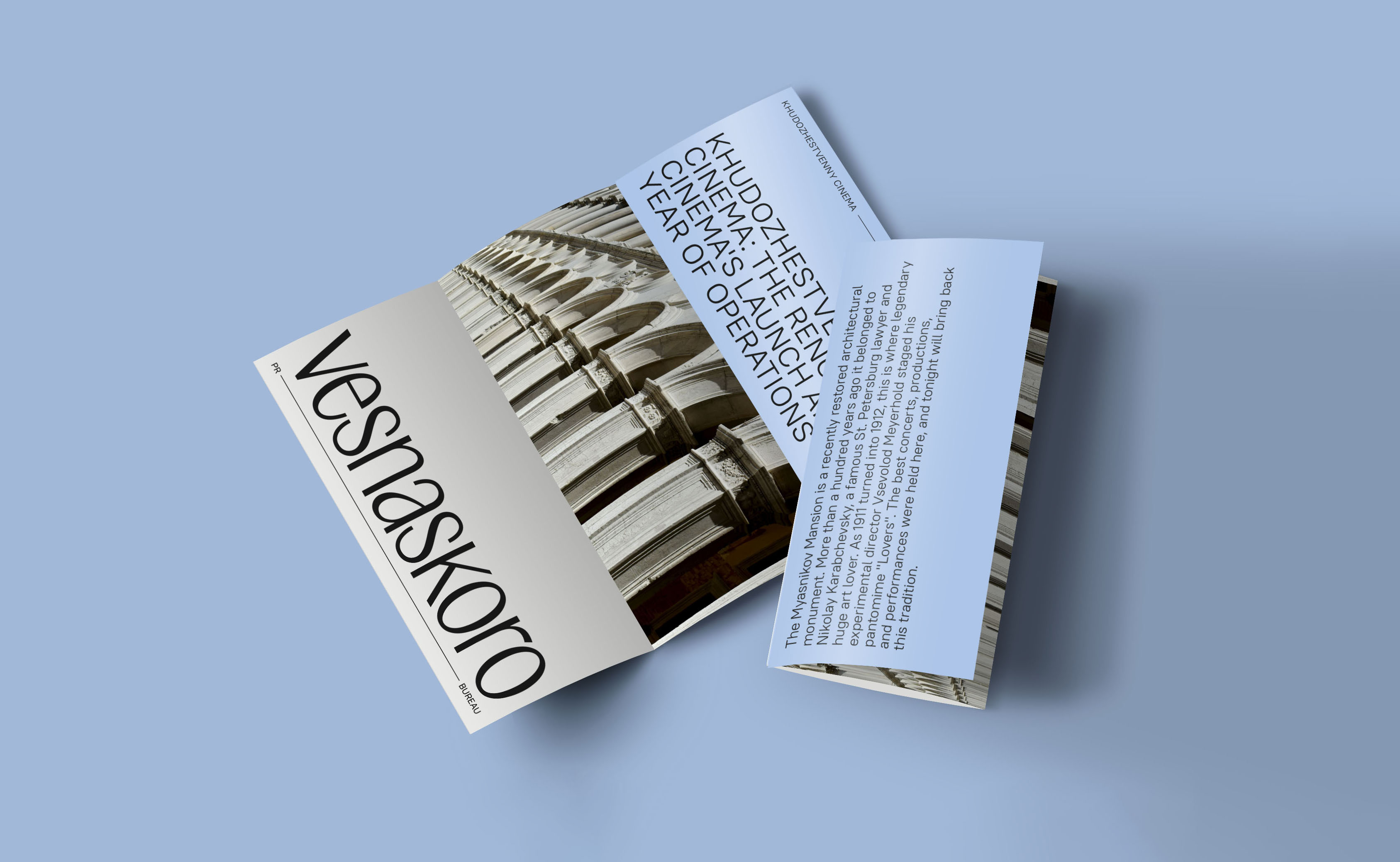
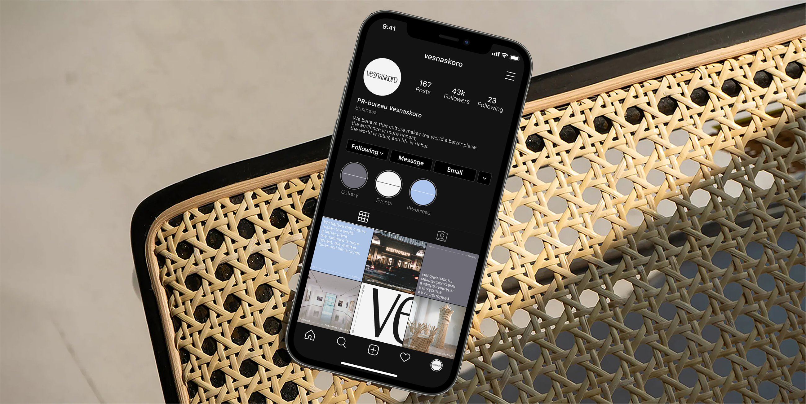
The main graphic element of the style became a horizontal guiding line, connecting two parts of the layout and reflecting a systematic approach to project work. The soft blue color in this concept evokes a spring mood, echoing the agency's name, while the calmer, warm gray balances the palette.
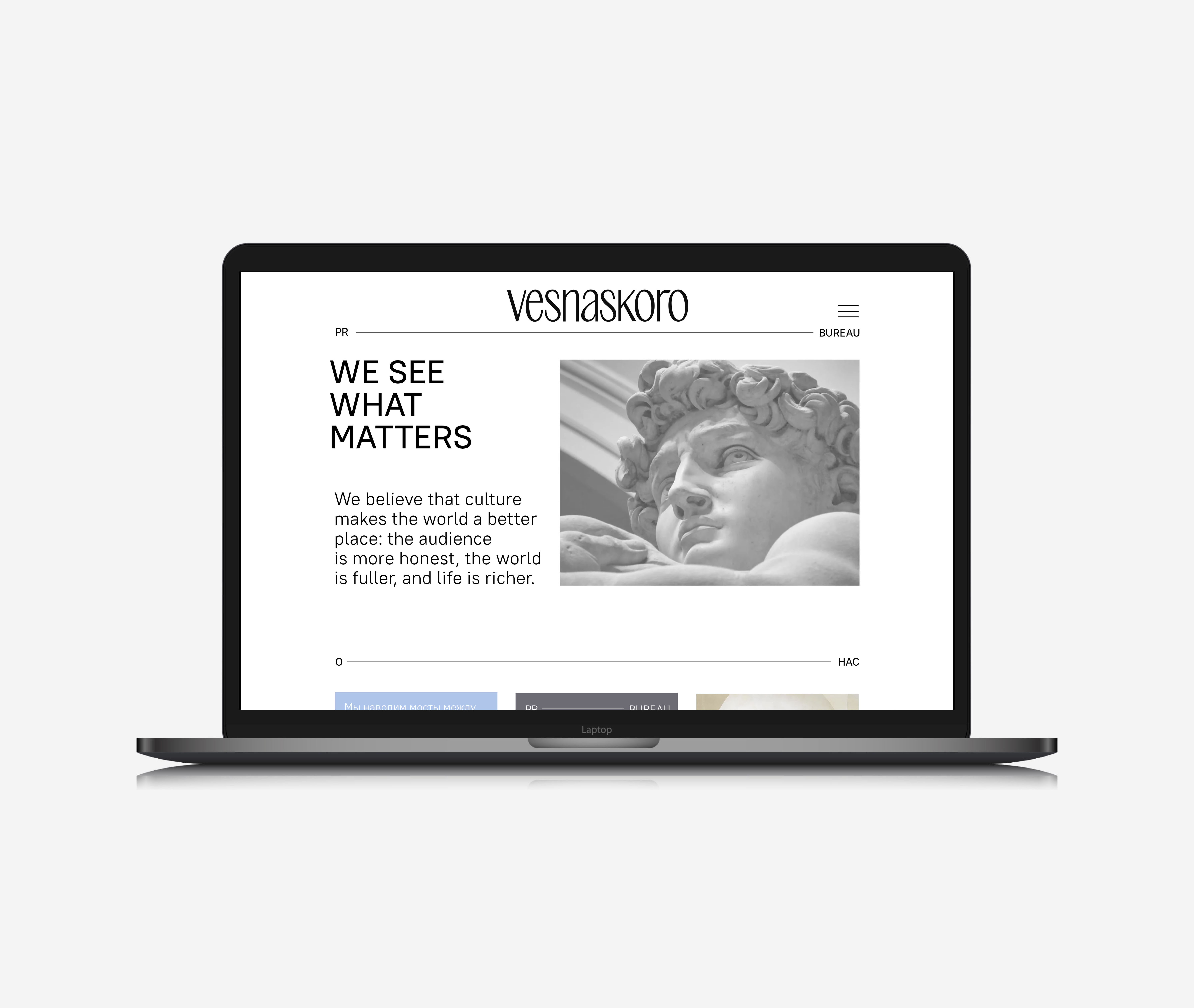
The logo is composed of lowercase letters, highlighting the brand’s friendliness and emphasizing the agency's main working principle — a warm and human approach to any endeavor